
Wednesday, March 23, 2011
The Album Leaf-Original


I love the coloring of the two beginning images. I took a selection I made in class for an exercise (photo of leaves) and combined it with a photo I found on the web a few years ago. I believe the second image, the one with the squares, is a photo of a painting. When I began combining the two images, I thought the photo with the squares looked like an album cover. That made me think of the band called the Album Leaf, which is where most of my inspiration came from for this image. Their music is very soothing and harmonious. What makes this photo stand out to me are the adjustments I made with the opacity. For the final touch I changed the top layer's blending mode to linear dodge (add).
The Album Leaf

This image is a alteration of the original image I made called the Album Leaf. Again, the opacity plays a major part of the appearance of the final image. The main difference, however is that I changed the top layer's blending mode to dissolve. I love that by doing this it gave the image an appearance of texture. I had to adjust the sizes of the original images because one was significantly larger than the other.
City Life


This final image is comprised of three different images I took at different times. The main image was taken of downtown Indy. The image of the dance club was taken in Panama City Beach over Spring Break, and the last image was take on Mass. Ave. I made two different layer masks beginning with bringing in the club photo. I took this layer's opacity down. I also lowered the opacity of tree layer.
The Sun Sets


I took this photo while on the way to Florida. I thought the sun setting looked gorgeous, but the car was moving when I captured the image. To try to take some of the blur out, I sharpened the image a little. I also changed the layer blend mode to color burn. I was not sure where else to go after making these adjustments or what else to add.
Life's a Beach


For this image I began by using the patch tool to remove the backpack and the person lying on the beach. I adjusted the layer blend mode to hard light. I also adjusted the levels of this photo to make the light and dark colors contrast more. Finally I lowered the opacity to about 80 on the copy of the first layer. I chose this image to serve as my image evoking emotion. When I look at this I see peacefulness and tranquility. It is a positive image; the light being the main focus surrounded by darkness.
Fireworks


This image is the same photo used three different times, just rotated. I did this by making two different layer masks. I also changed the layer blend mode to overlay on the top layer.
Wonder Works


I took both of these pictures in Florida and combined them. I love the insanity in this image. I changed the layer blend mode to darken on the top layer and lowered the opacity of the top layer as well.
Mass Ave.
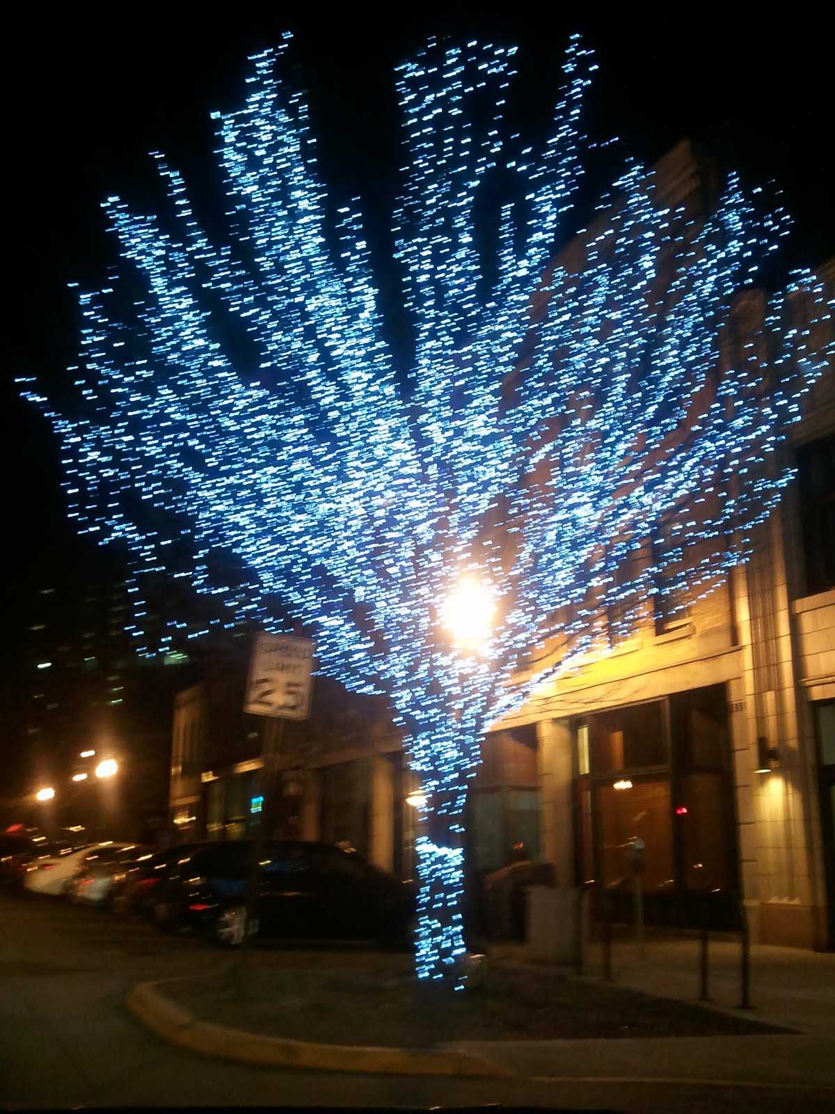

I captured this photo as well with the camera on my phone. The first layer's blending mode was set to color burn and took the opacity down to about 50%. I liked the contrast of the predominantly red store behind the blue tree. I added a shape on top of the first layer copy to try to cover the bright sign in the middle of the tree. I added a second shape and changed the layer blending mode to overlay. I also used the paint brush tool to make black swirls in the tree.
Club Med


I did not need to add a layer mask for this image because I just resized the photo of the beach and fit it into the photo of the dance club. I took both of these photos on my smartphone and was amazed at the quality of the camera. I changed the club layer's blending mode to hard mix and also changed the beach layer's blending mode to pin light so it would brighten the image. I really like the contrast of the two photos.
Get Buzzed


I reused this image for my portfolio because I really liked the idea of the two images composited. I chose this to be my metaphorical photo. I think the message of the photo is fairly easy to comprehend if you think about it for a second. The bee inside the wine glass is supposed to represent 'getting buzzed.' I changed a few things about this photo from my previous submission, one being that I added a drop shadow to the main photo. I also turned off the text because the image is supposed to create a message while standing alone. I changed the layer blending mode to soft light hoping it would help the photo give off more of a glow. I like how the darker colors are crisper and more definitive in this image compared to the previous one I submitted (you can see that if you turn off the wine layer visibility.) I also really like how rich the wood looks.
Subscribe to:
Posts (Atom)